I, like many others across the country have been in total shock and mental disarray at the results from the election this past Tuesday. I’m not sure what to make of my fellow Americans voting for an outright racist, sexist, homophobic and xenophobic egomaniac and what that will mean for the United States and frankly the World.
How do you model a variable for "embarrassed when polled, but on Election Day votes true racist beliefs"? https://t.co/f3aUhYHQTF
— Jasmine Dumas (@jasdumas) November 9, 2016
This was in response to David Smith’s original tweet about election forecasting
From the initial announcement of Donald Drumpf gaining the magic 270 electoral votes, I have been curious about the election data and eager to explore how my home state fared at the county level. I found a great visualization blog post from fellow useR, Julia Silge of her home state Utah which gave me ideas and starter code and county-level election data from Mike Kearny!
Here is the analysis and approaches that I took:
library(readr)
library(dplyr)
library(leaflet)
library(rvest)
library(ggplot2)
library(rgdal)
library(tidyr)
all_results <- read_csv("https://raw.githubusercontent.com/mkearney/presidential_election_county_results_2016/master/pres16results.csv")

# what is in here?
head(all_results)
## # A tibble: 6 × 8
##      X1 cand_id       cand_name    votes     total state  fips         pct
##   <int>   <chr>           <chr>    <int>     <int> <chr> <chr>       <dbl>
## 1     1  US8639    Donald Drumpf 59821874 126061003    US    US 0.474547025
## 2     2  US1746 Hillary Clinton 60122876 126061003    US    US 0.476934774
## 3     3 US31708    Gary Johnson  4087972 126061003    US    US 0.032428522
## 4     4   US895      Jill Stein  1223828 126061003    US    US 0.009708220
## 5     5 US65775   Evan McMullin   425991 126061003    US    US 0.003379245
## 6     6 US59414  Darrell Castle   175956 126061003    US    US 0.001395800
I ended up not doing as much exploratory data analysis as intended. The data set is coded with FIPS numbers. FIPS state codes are numeric codes defined in U.S. Federal Information Processing Standard Publication to identify U.S. states. Connecticut FIPS codes start with 09 - so I grabbed those out from the entire data set to explore.
head(levels(factor(all_results$fips)))
## [1] "01001" "01003" "01005" "01007" "01009" "01011"
ct_results <- all_results[grep("^09", all_results$fips), ]
head(ct_results)
## # A tibble: 6 × 8
##      X1 cand_id       cand_name  votes  total state  fips        pct
##   <int>   <chr>           <chr>  <int>  <int> <chr> <chr>      <dbl>
## 1  2718 CT20519 Hillary Clinton  38767  77380    CT 09013 0.50099509
## 2  2719 CT20520    Donald Drumpf  33983  77380    CT 09013 0.43917033
## 3  2720 CT20553    Gary Johnson   3179  77380    CT 09013 0.04108297
## 4  2721 CT20552      Jill Stein   1451  77380    CT 09013 0.01875162
## 5  2722 CT20519 Hillary Clinton 201578 372277    CT 09009 0.54147315
## 6  2723 CT20520    Donald Drumpf 157067 372277    CT 09009 0.42190895
To make things more readable, I added the county names to the data.frame and since Connecticut only has 8 counties, I can complete this step in an iterative approach by matching up the fips numbers.
# add the county names (8 in CT)
ct_results$county <- NA
# these are the full fips numbers associated with each county
fairfield <- "09001"
hartford <- "09003"
litchfield <- "09005"
middlesex <- "09007"
newhaven <- "09009"
newlondon <- "09011"
tolland <- "09013"
windham <- "09015"

ct_results$county[which(ct_results$fips %in% fairfield)] <- "Fairfield"
ct_results$county[which(ct_results$fips %in% hartford)] <- "Hartford"
ct_results$county[which(ct_results$fips %in% litchfield)] <- "Litchfield"
ct_results$county[which(ct_results$fips %in% middlesex)] <- "Middlesex"
ct_results$county[which(ct_results$fips %in% newhaven)] <- "New Haven"
ct_results$county[which(ct_results$fips %in% newlondon)] <- "New London"
ct_results$county[which(ct_results$fips %in% tolland)] <- "Tolland"
ct_results$county[which(ct_results$fips %in% windham)] <- "Windham"
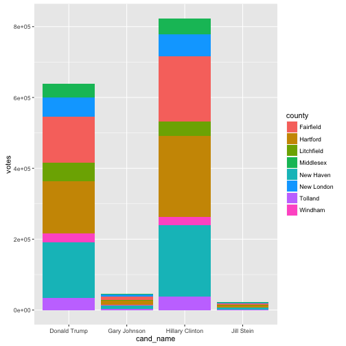
Here is a bar chart using ggplot2 of the election results by candidate, votes and county. I may add to this section later!
ggplot(ct_results, aes(x = cand_name, y = votes, fill = county)) +
  geom_bar(stat = "identity")
Shape files by county were downloaded with rgdal.
# CT level county shapefiles for 2015
tmp2 = tempdir()
url2 = "http://www2.census.gov/geo/tiger/GENZ2015/shp/cb_2015_us_county_500k.zip"
file <- basename(url2)
download.file(url2, file)
unzip(file, exdir = tmp2)
ct_shp <- readOGR(dsn = tmp2,
                  layer = "cb_2015_us_county_500k", encoding = "UTF-8")
## OGR data source with driver: ESRI Shapefile
## Source: "/var/folders/nv/c92g05zj4tnbkwp_x6y9ly6w0000gn/T//RtmpDG6lwP", layer: "cb_2015_us_county_500k"
## with 3233 features
## It has 9 fields
dim(ct_shp)
## [1] 3233 9
# fix the FIPS number in the shape file for merging
ct_shp@data$fips <- paste0(ct_shp@data$GEOID)
This election was fueled by discontent and ignorance of the “silent majority” around social and economic policies, so I thought it was worthwhile to gather some socio-economic data from https://datausa.io/ to enhance the election data. Data USA is a data viz tool that uses open public data from https://www.data.gov/ to share insights on occupations, industries and education. This data was web-scraped using rvest as the aggregated statistics by county are nestled in a web page.
# create a empty df
ct_econ <- data.frame(matrix(ncol=10, nrow = 0))

# add some economic data from https://datausa.io/ for each county by web-scrapping
county_urls <- c("https://datausa.io/profile/geo/fairfield-county-ct/",
                 "https://datausa.io/profile/geo/hartford-county-ct/",
                 "https://datausa.io/profile/geo/litchfield-county-ct/",
                 "https://datausa.io/profile/geo/middlesex-county-ct/",
                 "https://datausa.io/profile/geo/new-haven-county-ct/",
                 "https://datausa.io/profile/geo/new-london-county-ct/",
                 "https://datausa.io/profile/geo/tolland-county-ct/",
                 "https://datausa.io/profile/geo/windham-county-ct/")
#  for loop for each of the counties
for (i in county_urls){
  table <- read_html(i) %>%
    html_nodes(".stat-text+ .stat-value .stat-span") %>%
    html_text() %>%
    data.frame()
  # transpose into rows!
  table_keep <- t(data.frame(table[c(1:9, 17), ]))
  # append to a master data frame
  ct_econ <- rbind(ct_econ, table_keep)
}
# add column names / mentally choose which values to keep after looking on the website
colnames(ct_econ) <- c("med_house_income14",
                       "avg_male_income",
                       "avg_female_income",
                       "highest_income_race",
                       "wage_gini",
                       "largest_demo_poverty",
                       "largest_race_poverty",
                       "med_native_age",
                       "med_foreign_age",
                       "common_major")
ct_econ$county <- c("Fairfield", "Hartford", "Litchfield", "Middlesex",
                    "New Haven", "New London", "Tolland", "Windham")
At this point, I merged the election data with the socio-economic data after picking which stats I wanted to capture and created seperate shapefiles for each candidate.
# merge this with the ct_results with the economic data
ct_join <-  dplyr::full_join(ct_results, ct_econ)

# full join the data set
ct_join <- dplyr::full_join(ct_shp@data, ct_join)

# remove rows with NA's - i.e. remove everything except the choosen state
ct_clean = na.omit(ct_join)

# merge this with the entire shapefile object
ct_shp2 <- ct_shp
ct_shp2 <- sp::merge(x = ct_shp2, y = ct_clean,
                     by = "fips", all.x = F,
                     duplicateGeoms=TRUE)
# this is you're shapefile check
plot(ct_shp2)
## let's try a specific candidates for creating shape files - Hillary Clinton!!!
ct_clean_hrc <- ct_clean[which(ct_clean$cand_name == "Hillary Clinton"),]
ct_clean_hrc_join <- dplyr::full_join(ct_shp@data, ct_clean_hrc)
hrc_join <- na.omit(ct_clean_hrc_join)
hrc_shp <- sp::merge(x = ct_shp, y = hrc_join,
                     by = "fips", all.x = F,
                     duplicateGeoms=F)

## Donald Drumpf shape file
ct_clean_dt <- ct_clean[which(ct_clean$cand_name == "Donald Drumpf"),]
ct_clean_dt_join <- dplyr::full_join(ct_shp@data, ct_clean_dt)
dt_join <- na.omit(ct_clean_dt_join)
dt_shp <- sp::merge(x = ct_shp, y = dt_join,
                     by = "fips", all.x = F,
                     duplicateGeoms=F)

## Gary Johnson shape file
ct_clean_gj <- ct_clean[which(ct_clean$cand_name == "Gary Johnson"),]
ct_clean_gj_join <- dplyr::full_join(ct_shp@data, ct_clean_gj)
gj_join <- na.omit(ct_clean_gj_join)
gj_shp <- sp::merge(x = ct_shp, y = gj_join,
                    by = "fips", all.x = F,
                    duplicateGeoms=F)

## Jill Stein shape file
ct_clean_jt <- ct_clean[which(ct_clean$cand_name == "Jill Stein"),]
ct_clean_jt_join <- dplyr::full_join(ct_shp@data, ct_clean_jt)
jt_join <- na.omit(ct_clean_jt_join)
jt_shp <- sp::merge(x = ct_shp, y = jt_join,
                    by = "fips", all.x = F,
                    duplicateGeoms=F)
Spatial Analysis and mapping are a great way to visualize and understand this type of data, so I used leaflet for its interactivity to compare candidates and how many votes they received. This is the ground work for defining the color, popup info, and creating partitions for each candidate as their own base group on the map.
# create seperate color patterns for each candidate
pal1 <- colorBin(palette = "Blues", domain = hrc_shp$votes, bins = 8)
pal2 <- colorBin(palette = "Reds", domain = dt_shp$votes, bins = 8)
pal3 <- colorBin(palette = "YlOrRd", domain = gj_shp$votes, bins = 8)
pal4 <- colorBin(palette = "Greens", domain = jt_shp$votes, bins = 8)

# Populate statewide socio-economic values for popup!
state_popup1 <- paste0("<strong>County: </strong>",
                      hrc_shp$county,
                      "<br><strong>Total Amount of 2016 Voters: </strong>",
                      hrc_shp$total,
                      "<br><strong>Percentage of Earned Votes: </strong>",
                      round(hrc_shp$pct, 3)* 100, "%",
                      "<br><strong>Median Household Income: </strong>",
                      hrc_shp$med_house_income14,
                      "<br><strong>Average Female Income: </strong>",
                      hrc_shp$avg_female_income,
                      "<br><strong>Average Male Income: </strong>",
                      hrc_shp$avg_male_income,
                      "<br><strong>Wage Equality Index: </strong>",
                      hrc_shp$wage_gini,
                      "<br><strong>Largest Demographic in Poverty: </strong>",
                      hrc_shp$largest_demo_poverty)

state_popup2 <- paste0("<strong>County: </strong>",
                       dt_shp$county,
                       "<br><strong>Total Amount of 2016 Voters: </strong>",
                       dt_shp$total,
                       "<br><strong>Percentage of Earned Votes: </strong>",
                       round(dt_shp$pct, 3) * 100, "%",
                       "<br><strong>Median Household Income: </strong>",
                       dt_shp$med_house_income14,
                       "<br><strong>Average Female Income: </strong>",
                       dt_shp$avg_female_income,
                       "<br><strong>Average Male Income: </strong>",
                       dt_shp$avg_male_income,
                       "<br><strong>Wage Equality Index: </strong>",
                       dt_shp$wage_gini,
                       "<br><strong>Largest Demographic in Poverty: </strong>",
                       dt_shp$largest_demo_poverty)

state_popup3 <- paste0("<strong>County: </strong>",
                       gj_shp$county,
                       "<br><strong>Total Amount of 2016 Voters: </strong>",
                       gj_shp$total,
                       "<br><strong>Percentage of Earned Votes: </strong>",
                       round(gj_shp$pct, 3)* 100, "%",
                       "<br><strong>Median Household Income: </strong>",
                       gj_shp$med_house_income14,
                       "<br><strong>Average Female Income: </strong>",
                       gj_shp$avg_female_income,
                       "<br><strong>Average Male Income: </strong>",
                       gj_shp$avg_male_income,
                       "<br><strong>Wage Equality Index: </strong>",
                       gj_shp$wage_gini,
                       "<br><strong>Largest Demographic in Poverty: </strong>",
                       gj_shp$largest_demo_poverty)


state_popup4 <- paste0("<strong>County: </strong>",
                       jt_shp$county,
                       "<br><strong>Total Amount of 2016 Voters: </strong>",
                       jt_shp$total,
                       "<br><strong>Percentage of Earned Votes: </strong>",
                       round(jt_shp$pct, 3)* 100, "%",
                       "<br><strong>Median Household Income: </strong>",
                       jt_shp$med_house_income14,
                       "<br><strong>Average Female Income: </strong>",
                       jt_shp$avg_female_income,
                       "<br><strong>Average Male Income: </strong>",
                       jt_shp$avg_male_income,
                       "<br><strong>Wage Equality Index: </strong>",
                       jt_shp$wage_gini,
                       "<br><strong>Largest Demographic in Poverty: </strong>",
                       jt_shp$largest_demo_poverty)
Here is our map widgets! Feel free to explore and adapt this code for your analysis of a given state!
# plot the map(s)
hrc_map <- leaflet(data = hrc_shp) %>%
  addProviderTiles("CartoDB.Positron") %>%
  addPolygons(fillColor = ~pal1(votes),
              fillOpacity = 1,
              color = "#BDBDC3",
              weight = 1,
              popup = state_popup1) %>%
  addLegend("bottomright",
            pal = pal1,
            values = ~votes,
            title = "Total Votes for Hillary Clinton: ",
            opacity = 1)
print(hrc_map)

dt_map <- leaflet(data = dt_shp) %>%
  addProviderTiles("CartoDB.Positron") %>%
  addPolygons(fillColor = ~pal2(votes),
              fillOpacity = 1,
              color = "#BDBDC3",
              weight = 1,
              popup = state_popup2) %>%
  addLegend("bottomright",
            pal = pal2,
            values = ~votes,
            title = "Total Votes for Donald Drumpf: ",
            opacity = 1)
print(dt_map)


gj_map <- leaflet(data = gj_shp) %>%
  addProviderTiles("CartoDB.Positron") %>%
  addPolygons(fillColor = ~pal3(votes),
              fillOpacity = 1,
              color = "#BDBDC3",
              weight = 1,
              popup = state_popup3) %>%
  addLegend("bottomleft",
            pal = pal3,
            values = ~votes,
            title = "Total Votes for Gary Johnson: ",
            opacity = 1)
print(gj_map)


jt_map <- leaflet(data = jt_shp) %>%
  addProviderTiles("CartoDB.Positron") %>%
  addPolygons(fillColor = ~pal4(votes),
              fillOpacity = 1,
              color = "#BDBDC3",
              weight = 1,
              popup = state_popup4) %>%
  addLegend("bottomleft",
            pal = pal4,
            values = ~votes,
            title = "Total Votes for Jill Stein: ",
            opacity = 1)
print(jt_map)
Here is the GitHub repo for this work: https://github.com/jasdumas/ct-election-2016